


Styling graphs in data science is simply a way of uniquely representing plotted data. The matplotlib package must be installed in order to plot and style graphs in Python. Learn how to install the matplotlib package here.
note!! The same styling commands are used for scattered plots
Changing the color of your graph
plt.plot(x-values, y-values, color=’green’)
for scattered plots,
Plt.scatter(x-values, y-values, color='green')
Python provides a list of visualizing colors. As a result, you cannot use any color. The list of available colors can be found here.
Changing the width of a line
plt.plot(x-values, y-values, linewidth= any_number)
Changing the linestyle
A line can be styled in a variety of ways as follows
- Creating a straight line
plt.plot(x-values, y-values, linestyle ='-')
- Creating a dotted line
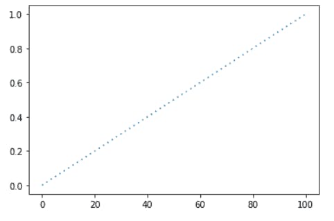
syntax: plt.plot(x-values, y-values, linestyle=’:’)
- Creating a dashed line
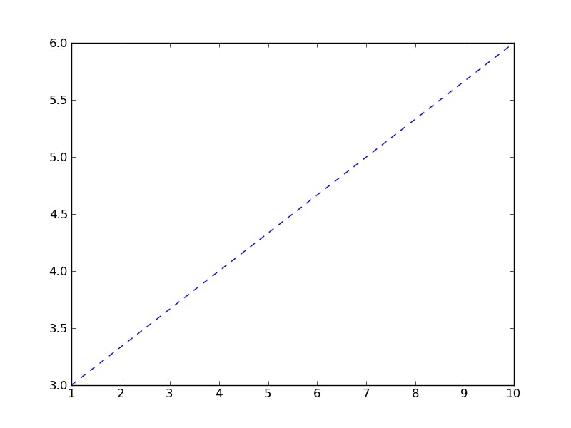
syntax: plt.plot(x-values, y-values, linestyle=’--’)
###- Creating the dashed-dotted line
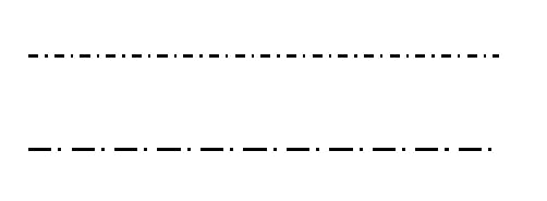
syntax: plt.plot(x-values, y-values, linestyle=’-.’)
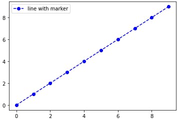
Adding markers
The marker parameter is added to our function.
plt.plot( x-values, y-values, marker="o’’)
The marker "o" marks points in a circle.
Python has its own set of markers that you can use. You can find them here.
Adding a random text
A random text refers to any text which can be added to your graph. The majority of data scientists use random text to mark specific points on a graph as in the example below
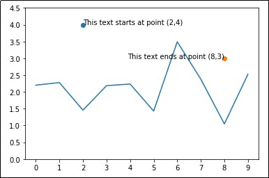
The image above shows 2 points (2,4) and (8,3) where a particular text starts and ends.
The following syntax is used to add arbitrary text.
plt.text(x_axis_point, y_axis_point, 'text message')
Example:
Plt.text(5, 9, 'usually low')
The above syntax indicates that the text 'usually low' should be placed on your graph at point 5 on the x-axis and point 9 on the y-axis.
Text Editing
- Setting the text size
plt.rc('font', size=any_int_number)
- Setting the font size of the axis
plt.rc('axes', titlesize=any_int_number)
- Setting the font size of the x and y labels
plt.rc('axes, labelsize=any int number)
- Setting the font size of the x tick label
Plt.rc('xtick', labelsize=any_int_number)
- Setting the font size of the x tick label
Plt.rc('ytick', labelsize=any_number)
- Setting the font size of the title
plt.rc('figure', titlesize=any_number)
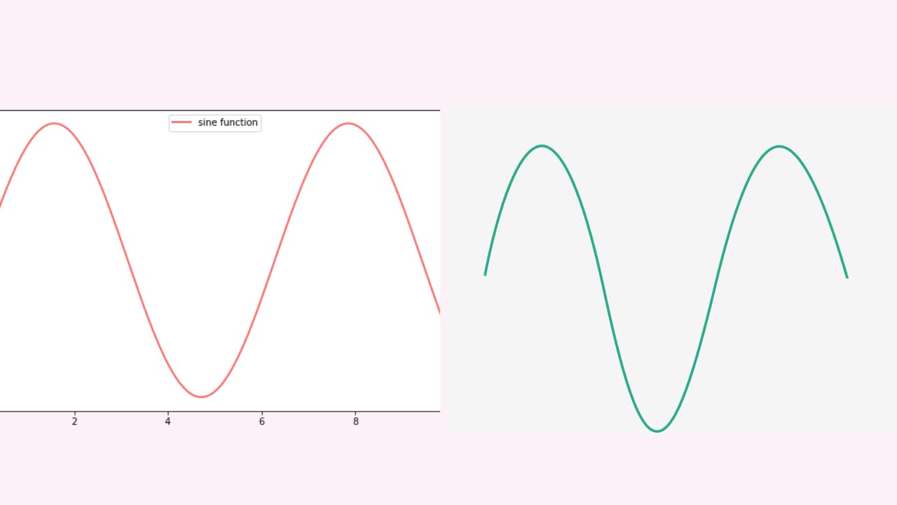
Plot Styles
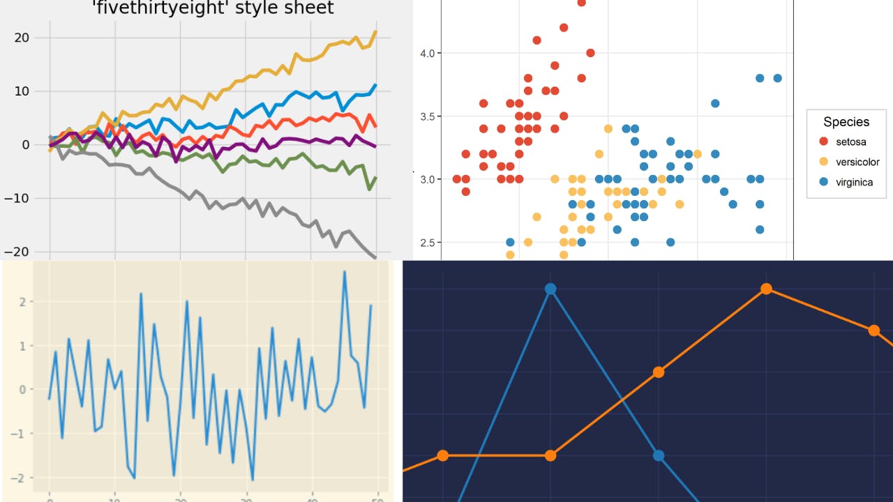
Python has a wide variety of plot styles. The command below displays all of the available plot styles in python.
Import matplotlib.pyplot as plt
From matplotlib import styles
print(plt.style.available)
Output
- bmh
- classic
- dark_background
- fast
- fivethirtyeight
- ggplot
- grayscale
- seaborn-bright
- seaborn-colorblind
- seaborn-dark-palette
- seaborn-dark
- seaborn-darkgrid
- seaborn-deep
- seaborn-muted
- seaborn-notebook
- seaborn-paper
- seaborn-pastel
- seaborn-poster
- seaborn-talk
- seaborn-ticks
- seaborn-white
- seaborn-whitegrid
- seaborn
- Solarize_Light2
- tableau-colorblind10
- _classic_test
To set a plot style you can use the syntax
plt.style.use(‘ggplot’)
Where ggplot is one of the plot styles available in Python.
Changing the Graph's Transparency
The alpha argument in Python is used to change the transparency. Alpha ranges from 0 to 1. The greater the transparency, the lower the alpha number.
To change the transparency of your graphs, use the command.
plt.plot(“x-values”, “y-values”, alpha=any_number_from_1-10)
Resources
Properly learn about artificial intelligence.
Begin your machine learning journey.
Discover more about data science.
K.Faith